
Design audit · My Account
The account portal knows a lot.
It tells you almost none of it.
It tells you almost none of it.
Four screens of the logged-in customer portal reviewed against heuristics, WCAG 2.2 AA and eleven benchmark retailers in NZ, AU, the UK and the US. Every finding is pinned to the pixel that causes it and paired with a proposed fix.
ReviewedDashboard · Bills · Electricity · Broadband
Environmentuat-app.pulseenergy.co.nz, 8 Aug 2026
PlatformDesktop web + mobile web
Findings31 · 8 critical, 11 high, 12 medium
Severity key
1Critical — blocks or misleads on a core task
2High — costs the customer time or a support call
3Medium — polish, consistency, opportunity
Where it stands
Answering “what do I owe?”
2 / 5
Getting a task done
3 / 5
Usage data that means something
1 / 5
Consistency with the brand system
2 / 5
Accessibility (WCAG 2.2 AA)
1 / 5
Tone of voice
2 / 5
The portal is functionally complete and visually calm. What it lacks is a point of view: it shows five money figures without saying which one matters, and twelve months of kWh without ever converting them to dollars. Both gaps are now table stakes with the retailers Pulse is compared against.
Five moves, in order
01
Make the balance card say one thing
One headline number, one date, one action, sized to the account's actual state. Move the ledger detail behind “How this was worked out”.
02
Put dollars on the usage chart
A $ / kWh toggle plus last-year comparison. Every benchmark retailer has this; it is the single largest capability gap.
03
Fix the header and the sidebar
The greeting overflows its container on every page, the green nav stops two-thirds down, and no nav item shows where you are.
04
Turn billing history into a statement list
Status per row, billing period not just statement number, right-aligned amounts, year grouping, and quiet download links instead of thirty green buttons.
05
Let people self-serve SmoothPay
“Email our team to set this up” is the only route to a payment plan. Competitors set one up in the account in under a minute.
01 Dashboard
The page that has to answer “what do I owe, and when?”
Today
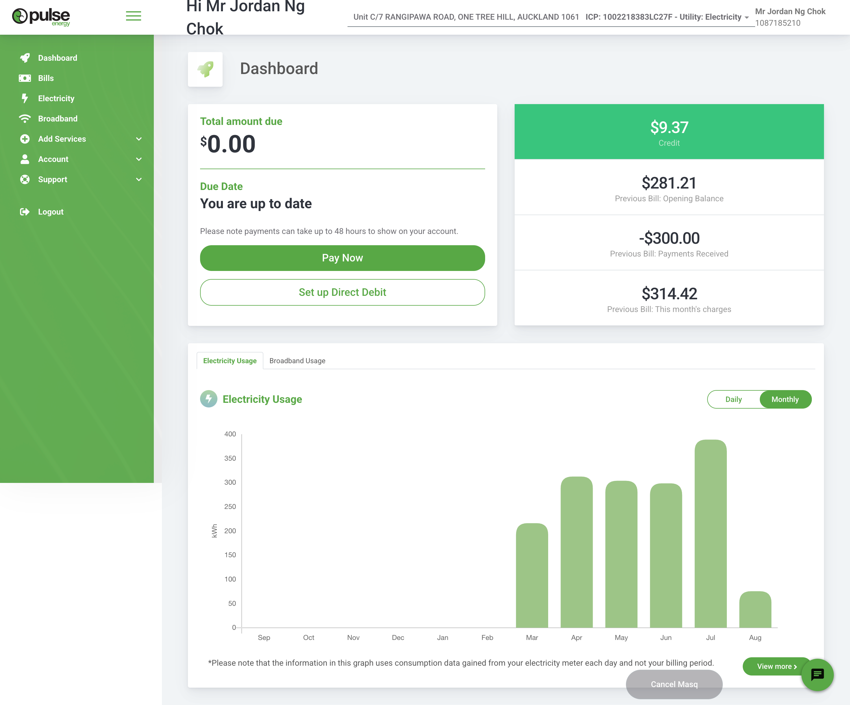
uat-app.pulseenergy.co.nz/user/dashboard · captured 8 Aug 2026 at 1440px
Findings
1
The greeting breaks out of the header
“Hi Mr Jordan Ng Chok” wraps onto a second line that sits outside its container and overlaps the page canvas. It happens on all four screens, so it is not an edge case — it is the first thing every long-named customer sees.
Fix · Give the header a fixed height with a single-line, truncating greeting. Drop the honorific and surname: “Hi Jordan”.
2
“Pay Now” is the primary action on a $0.00 balance
The most prominent element on the page asks for money that isn't owed. The card already knows the state — “You are up to date” — but the button doesn't change with it.
Fix · Make the CTA state-driven: Pay now when in arrears, Set up direct debit when up to date and not on DD, See your last bill otherwise.
3
Five money figures, no story
$0.00 due, $9.37 credit, $281.21 opening balance, −$300.00 payments received, $314.42 this month's charges. None carry a date, none are labelled current, and two contradict each other at a glance. This is a ledger printed as a dashboard.
Fix · One headline number and one date. Put the ledger behind a “How we worked this out” disclosure, with dates on every line.
4
The account switcher is disguised as an ICP number
“ICP: 1002218383LC27F - Utility: Electricity ▾” is the control that switches property and service, but it reads as system metadata and its only affordance is a 10px caret. Customers with two properties or gas plus power will miss it.
Fix · A labelled switcher pill showing the street address first, service second, with the ICP as secondary detail inside the menu.
5
The nav stops two-thirds down, and nothing shows where you are
The green panel ends mid-page leaving a white block below it, and no item is highlighted for the current page. The sub-menus also expand inconsistently between pages, so the nav looks different every time you land.
Fix · Full-height sticky sidebar, persistent active state, and menu expansion state that follows the current route.
6
Usage is only ever kWh, never dollars
Customers reason in money. Octopus lets you flip the same graph between kWh and currency in the top right corner, and Mercury reports usage against the charges that make it up. Pulse offers no conversion anywhere in the portal.
Fix · A $ / kWh toggle on every usage chart, with fixed daily charge shown separately so the totals reconcile to the bill.
7
Half the chart is empty and unexplained
Sep to Feb render as blank space with axis labels. There is no “no data for this period” state, so a data gap looks like zero consumption — or a broken page.
Fix · Clip the axis to months with data, or render an explicit muted “no reads” band with a one-line reason.
8
A title band that repeats the nav
An icon tile plus the word “Dashboard” costs roughly 140px above the fold, restating the highlighted nav item. On a 768px-tall laptop that is a fifth of the first screen.
Fix · Remove it. The balance is the page title.
9
White on light green fails contrast
The “$9.37 Credit” block puts white text on a mid-green fill at roughly 2.2:1 — under half the 4.5:1 AA minimum. The pale usage bars sit at about 1.6:1 against white.
Fix · Dark text on the brand tints, white text only on --pulse-green-700 or darker. Deepen chart bars to the primary green.
10
Floating elements collide bottom-right
The chat launcher sits on top of “View more”, and the grey “Cancel Masq” pill overlaps card content. Confirm the masquerade control is stripped in production, and reserve a safe area for the launcher.
Fix · Bottom padding equal to the launcher's footprint, and move staff-only controls into a top utility bar.
What already works
The card rhythm is calm and generously spaced, direct debit is offered right beside payment, and electricity and broadband already share one tabbed usage view — a genuine advantage over single-service portals.
Proposed




Built from Pulse tokens. Numbers are the real ones from the captured account.
02 Bills
Thirty-one statements, no status, no pagination, no periods
Today
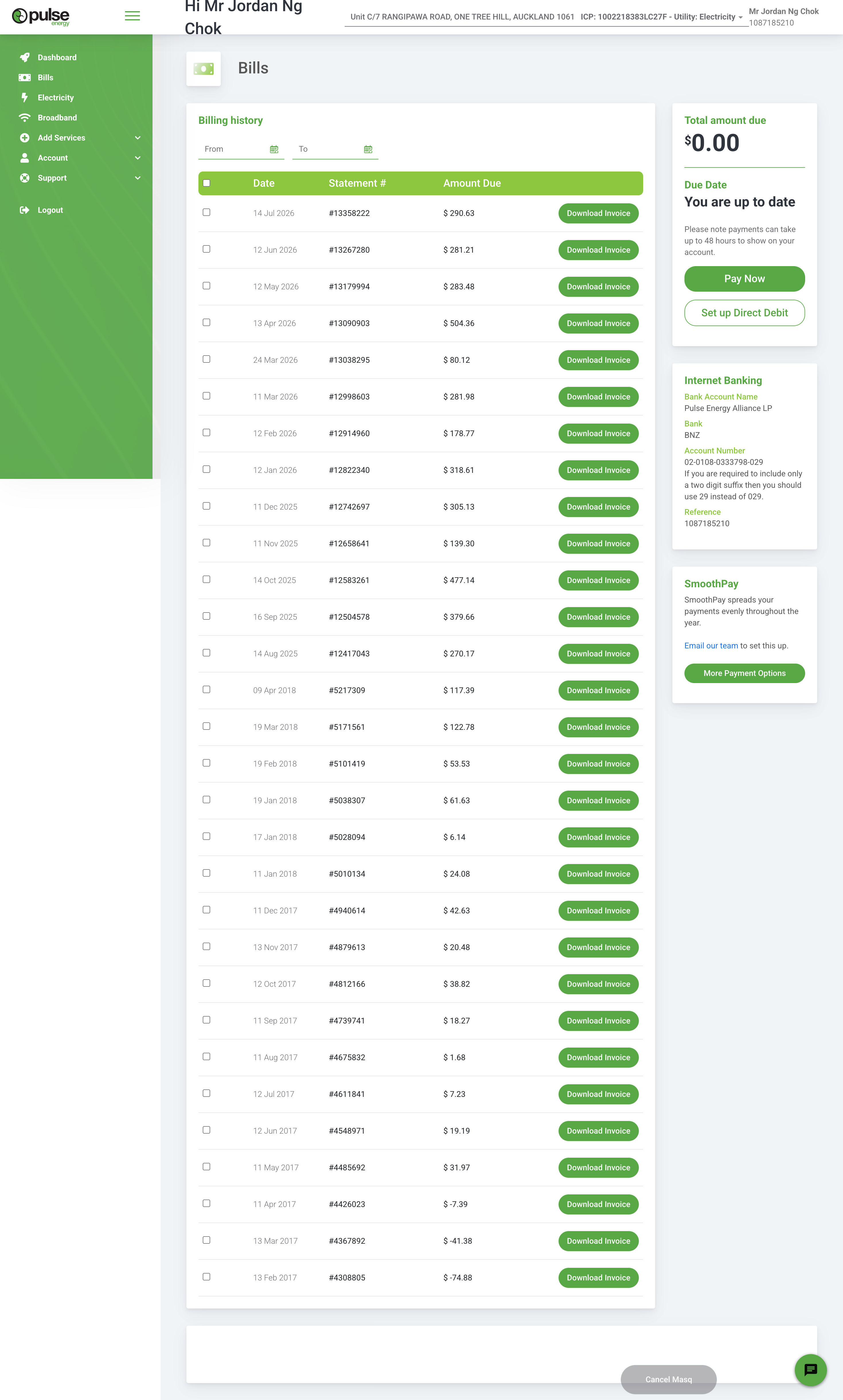
Full-page capture. The list renders all 31 statements at once.
Findings
11
A seven-year gap sits in the middle of the list, unexplained
14 Aug 2025 is followed immediately by 09 Apr 2018. Every statement ever issued is dumped into one unpaginated, ungrouped table, so the jump reads as missing data rather than a gap in service.
Fix · Group by year with sticky year headers, default to the last 12 months, and render an explicit divider for gaps in supply.
12
No statement tells you whether it was paid
There is no status column. Credits such as −$74.88 are typeset identically to charges, and the currency spacing (“$ -7.39”) makes the sign easy to miss. “Was my March bill paid?” cannot be answered on this page.
Fix · A status pill per row — Paid, Due, Overdue, Credit — and format credits as “−$74.88 credit” in a distinct colour.
13
Thirty-one solid green primary buttons
Repeating the brand's primary CTA on every row destroys its meaning — nothing on the page reads as more important than anything else, and the column dominates a table people came to scan.
Fix · Make the row itself open the statement. Reduce download to a quiet icon button, and keep one true primary CTA per page.
14
Select-all checkbox with nothing to select for
The column and its header checkbox appear on load, but no bulk action ever surfaces. The 16px hit target is also under the 24px WCAG 2.2 target-size minimum.
Fix · Either ship the bulk action (download selected as one PDF/ZIP) with a contextual action bar, or remove the column.
15
SmoothPay is explained, then handed to email
“Email our team to set this up” is the only route, and the link renders in default browser blue rather than a brand colour. Mercury sets the equivalent plan up inside the app, and reviews the amount every four months automatically.
Fix · Self-service setup with a suggested weekly amount from the last 12 months of usage, plus an eligibility check up front.
16
Statement number outranks the billing period
Customers look for “the one that covered June”. The table gives them an issue date and an eight-digit reference, and never states the period a statement covers.
Fix · Lead with the period (“12 Jun – 13 Jul 2026”), keep the issue date secondary, and demote the statement number to hover or detail.
17
Amounts are left-aligned and not tabular
$80.12 and $504.36 start at the same x-position, so decimal points never line up and the column can't be scanned for the big months.
Fix · Right-align with tabular figures (font-variant-numeric: tabular-nums).
18
Empty From / To pickers do all the filtering work
Two blank date fields, no presets, no apply or clear, no indication of the range currently shown. Filtering to “this financial year” takes two calendar journeys.
Fix · Preset chips (Last 12 months · This year · Last year · All) with the custom range tucked behind “Custom”.
19
A stray empty card closes the page
An empty white container renders below the table. Bank transfer details also sit in the right rail below the fold — useful, but invisible on a page this long.
Fix · Remove the empty container; fold bank details into a “Ways to pay” disclosure at the top of the rail.
Proposed
03 Electricity & Broadband usage
Two pages that show data without ever interpreting it
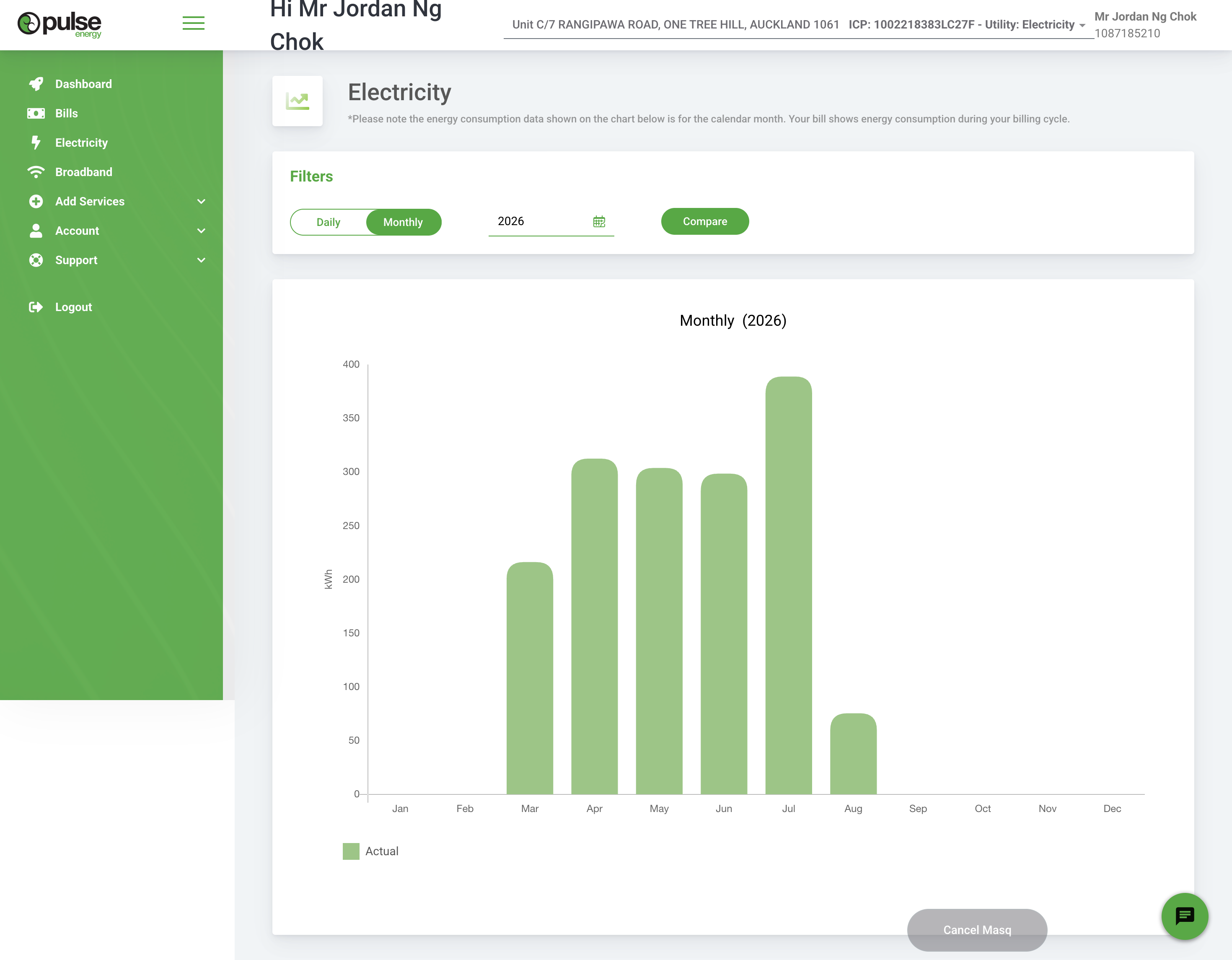
Electricity — today
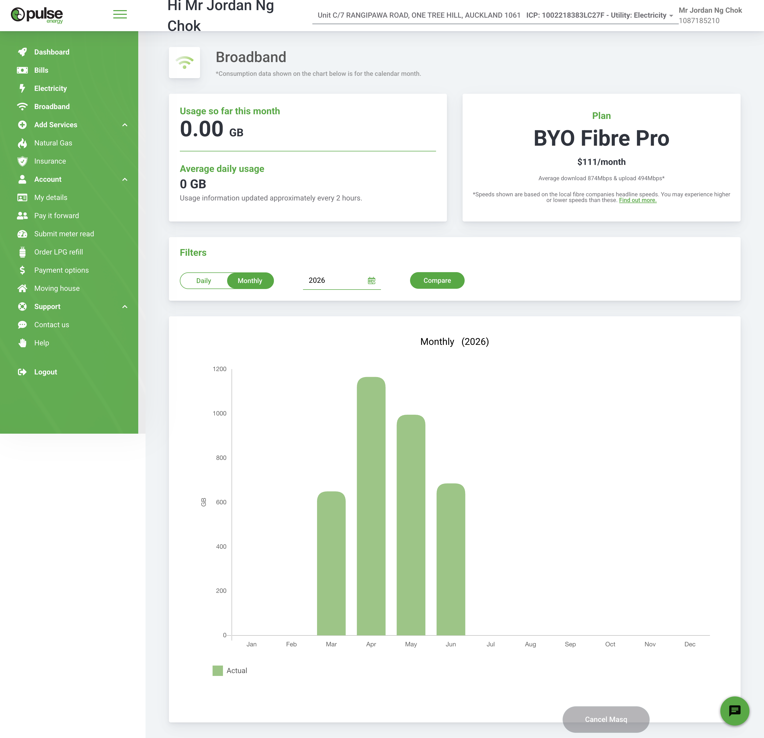
Broadband — today
Findings
20
The whole page is kWh, and nobody budgets in kWh
This is the largest capability gap in the audit. Octopus shows usage in kWh or currency with a toggle in the top-right of each graph, and Mercury breaks daily, weekly and monthly usage down into the fixed and variable charges behind it. Pulse offers neither, so the chart cannot be reconciled against a bill.
Fix · $ / kWh toggle, unit rate and daily fixed charge stated on the page, and a total that matches the invoice.
21
Six of twelve columns are empty
Filtering to “2026” renders Jan, Feb and five future months as blank space. The chart spends more pixels on nothing than on data, and there is no way to see a rolling 12 months across a year boundary.
Fix · Default to a rolling 12-month window with a period stepper, not a calendar-year filter.
22
“Compare” doesn't say what it compares
A solid green button sits beside a year field with no label, no second period and no result state. Comparison is the most valuable thing a usage page does, and here it's a mystery control.
Fix · Replace with a “Compare with last year” switch that overlays the previous period directly on the chart.
23
The chart is the only way to read the data
No value labels, no tooltips, no keyboard focus on bars, no table alternative and no CSV. A screen-reader user gets nothing from this page, which puts it outside WCAG 1.1.1.
Fix · Hover and focus tooltips, a “View as table” toggle, and a CSV download.
24
A legend for a single series
“Actual” labels the only thing on the chart. It occupies legend space that a comparison series should own.
Fix · Drop it until there are two series to distinguish.
25
The page subtitle is a disclaimer
“*Please note the energy consumption data shown on the chart below is for the calendar month…” — 26 words of caveat in the position where the page should be telling you what it's for. The brand book asks for short, plain, no waffle.
Fix · Move the caveat to an info tooltip on the chart. Subtitle: “Calendar months. Your bill runs 12th to 11th.”
26
Broadband says 0.00 GB above a chart showing 1,100 GB
“Usage so far this month: 0.00 GB” and “Average daily usage: 0 GB” sit directly above months of heavy usage, and the chart itself stops in June. The customer can't tell whether the connection is down, the data is late, or the page is broken.
Fix · A real no-data state: “No usage recorded yet this month — we last heard from your connection on 30 Jun.”
27
Zero and “no data” are drawn identically
Jul through Dec render as flat baseline, the same as a month of genuinely zero use. Six of twelve months carry no information at all.
Fix · Hatch or grey out periods with no reads and label them once under the axis.
28
The plan card is a poster, not a control
“BYO Fibre Pro · $111/month” is centred marketing typography in a data context, with no next-charge date, no contract or term, no included extras, and nothing to change, pause or compare the plan. It's the only place the plan appears, and it does nothing.
Fix · Left-aligned plan summary with next charge date and a “Change plan” action. Kiwi Central puts plan, speed test and support in the same view.
29
Two number formats in adjacent cards
“0.00 GB” sits directly above “0 GB”. Small, but it is the kind of inconsistency that makes people doubt the numbers that matter.
Fix · One rounding rule per unit, applied by a shared formatter.
30
Centred 11px fine print inside a card
The speeds disclaimer is centre-aligned, grey, and below the minimum body size used anywhere else in the portal. Centred paragraphs are also the hardest alignment to read at small sizes.
Fix · Left-align at 14px minimum, or collapse behind “What affects my speed?”.
31
The same nav renders three different heights
Across the four captures the sidebar is collapsed, half-expanded and fully expanded, and the green panel ends at a different point each time. Nav should be the one constant in the product.
Fix · One nav component, expansion driven by route, full viewport height on every page.
Proposed
04 Cross-cutting
The system problems behind the page problems
Green is doing seven jobs
In the current portal the brand green is the logo, the nav, the headings, the links, the table header, the success state, the primary button, the secondary button outline and the chart bars. When everything is emphasised, nothing is. The brand book asks for hierarchy built from weight rather than colour, and it warns against page-wide use of the gradient.
Proposed split
Primary green — one CTA per view, active nav, brand marks. Nothing else.
Dark grey — all headings, all data labels, all body copy.
Green 50 — insight strips and success states, always with dark text.
Brand blue & amber — credits, information, and “needs attention”, so status stops competing with brand.
Voice
The portal opens with “Hi Mr Jordan Ng Chok” and leads two of four pages with an asterisked disclaimer. The brand book asks for short, simple, spoken, active, no waffle. Rewriting nine strings changes the feel of the whole product:
Total amount due $0.00 — You are up to dateNothing to pay right now
Please note payments can take up to 48 hours to show on your account.Payments take up to two days to show here.
Email our team to set this up.Set up SmoothPay — takes about a minute.
Usage information updated approximately every 2 hours.We update this every couple of hours.
Accessibility — the eight to fix first
Assessed against WCAG 2.2 AA from the captures. A full audit needs the live DOM and assistive-tech testing, but these are visible from the pixels alone.
1.4.3White text on mid-green in the credit block, roughly 2.2:1 against a 4.5:1 requirement.
1.4.11Pale green chart bars at about 1.6:1 on white — non-text contrast needs 3:1.
1.1.1Charts carry no text alternative, no data table and no per-point labels.
2.5.8Row checkboxes and the utility-switcher caret sit under the 24×24px target minimum.
2.4.7No visible focus style anywhere in the captures; the design system defines a 3px green ring that isn't being used.
2.4.8No active navigation state, so location is only conveyed by the page title band.
1.4.411–12px centred grey fine print in the broadband plan card.
1.3.1Billing history uses a header row with no scope or caption, and the select-all control has no accessible name.
Energy is an essential service with a medically-dependent customer register behind it. Accessibility here isn't polish — for some customers it decides whether they can manage their own supply.
Proposed — mobile web
Same content model, one column, 44px minimum targets. No table ever goes to mobile — statements become rows.
05 How others do it
Checked against published product documentation, August 2026
Octopus Energy · UK
Money and units are one toggle apart
Usage graphs run in kWh or currency, switched in the top-right corner of each graph, with half-hourly detail where the meter allows and tap-to-inspect on any bar. The cost view is explicit that it excludes VAT and standing charges, so it never quietly contradicts the bill.
Take · The toggle is cheap. The honesty about what it excludes is what makes it trusted.
Electric Kiwi · NZ
One mechanic, surfaced everywhere
Hour of Power is chosen and changed in the account, savings from it are shown back to the customer, and an alert fires before the free hour starts. Power, broadband and mobile sit in one place, with an in-account grid-greenness tool for shifting load.
Take · Pulse's community ownership and Pay it Forward are equivalent stories, and neither appears in the account.
Mercury · NZ
The account comes to you
A weekly usage summary is pushed every Wednesday, hourly and daily tracking sits behind it, and SmoothPay is set up in-product then reviewed automatically every four months so the amount stays right.
Take · Pulse's SmoothPay is the same product held behind an email address.
Contact, Meridian, Genesis, Frank, Nova, Origin, AGL, Red, OVO, British Gas and the US retailers on your list weren't inspected in this pass. Say the word and I'll extend the matrix — the account-level detail needs a login or published product docs for each.
06 What to do, in what order
Numbers in brackets are the findings above
Now
Days, not sprints
Bugs and copy. No new data, no new services, no design debate.
1Fix the overflowing greeting; shorten to “Hi Jordan”.
2Swap the CTA when the balance is zero.
5Full-height sidebar and an active nav state.
9Contrast pass on the credit block, chart bars and fine print.
10Confirm “Cancel Masq” never ships to production; reserve space for the chat launcher.
13Demote 31 download buttons to quiet links; make rows clickable.
17Right-align amounts with tabular figures.
25Rewrite the nine disclaimer strings; move caveats to tooltips.
Next
This quarter
Rebuild the three pages around the questions people actually arrive with.
3One balance card: headline, date, one action, ledger behind a disclosure.
20$ / kWh toggle, rates on the page, totals that reconcile to the bill.
22Compare-with-last-year overlay replacing the unlabelled Compare button.
11Statement list: periods, status pills, year grouping, preset filters, paging.
15Self-service SmoothPay and direct debit with a suggested amount.
26Real empty, loading and stale-data states for every chart and figure.
4A real property and service switcher, address first.
23Accessible charts: tooltips, focus order, table view, CSV.
Later
Needs discovery
Where the portal stops being a statement viewer and starts being useful.
Half-hourly data where smart meters allowThe prerequisite for load-shifting advice, and the one thing the current architecture can't fake.
Proactive notificationsBill ready, unusually high week, meter read due, payment failed. Every benchmark retailer pushes; Pulse waits to be visited.
Bill forecastingA projected total mid-cycle is the single most requested feature in utility self-service, and Pulse already holds daily meter data.
Bring the brand story into the accountCommunity ownership and Pay it Forward are the differentiators, and the logged-in product never mentions either.
Outage status and medically-dependent registerBoth exist as company commitments. Neither is visible or actionable in the account.
Findings were made from static full-page captures of the UAT environment. Interaction states, error states, the login and registration journey, meter-read submission, payment options and the moving-house flow weren't in the set — those are the next screens to capture if you want the audit to cover the full journey list.
Send the remaining screens
and I'll extend the board.
and I'll extend the board.